BEAM — Payment Web App

MY ROLE
User Research / Information Architecture / Prototyping / Usability Testing / UI Design
TOOLS
Figma / Figjam / Usability Hub / Optimal Workshop / Adobe Photoshop
BACKGROUND
Student Project at CareerFoundry ➜
DURATION
10 months (Part-time)
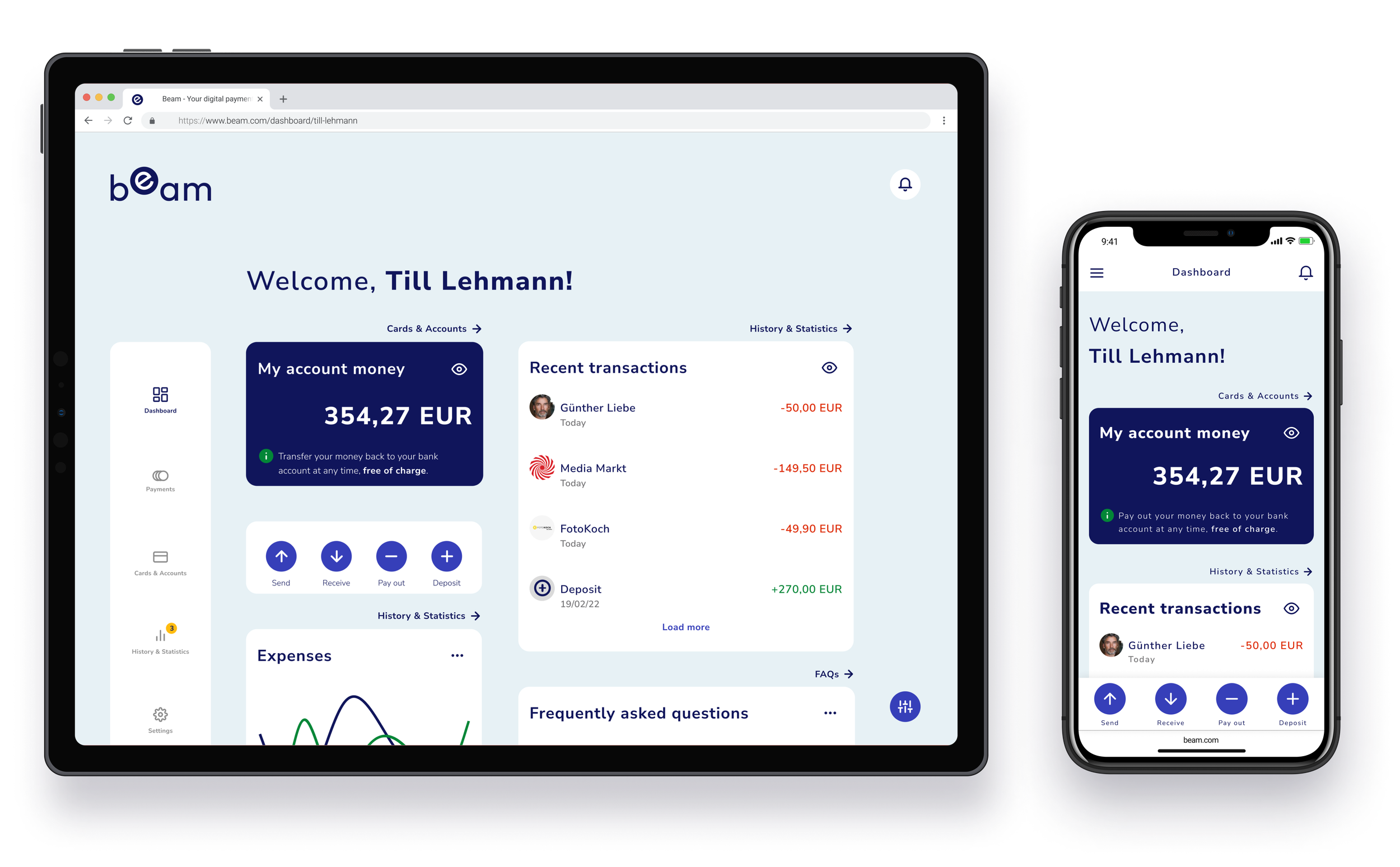
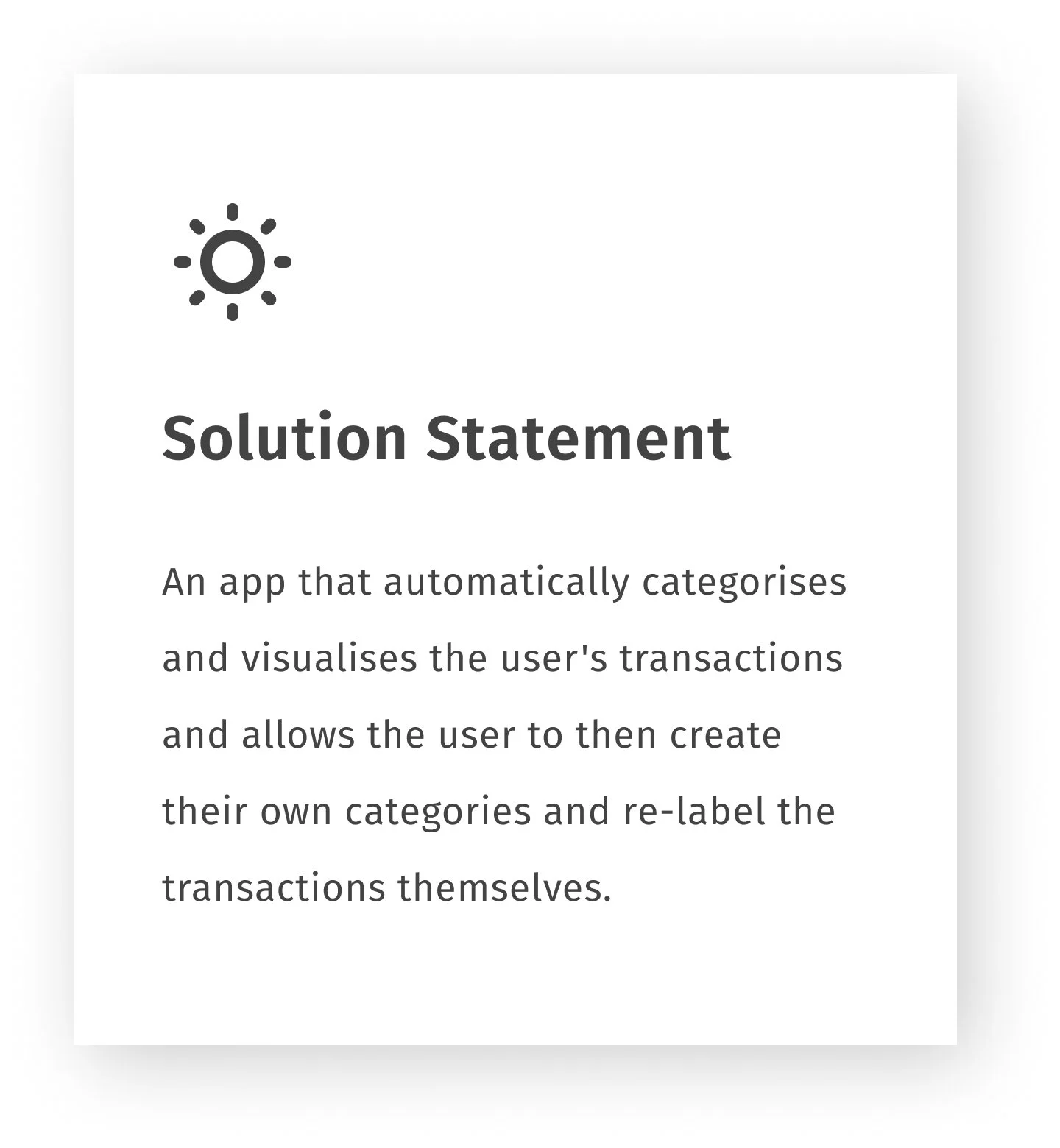
Beam is a responsive web application for digital money transactions. This study is an example of a user-oriented approach. With the help of the Design Thinking process, two significant issues were identified that led to the refined functions of the application: the categorisation of transactions with the help of tags and the careful handling of user data.
It should be noted that this project was created in the course of several months of training in user experience design. Three features of an application were created based on a fixed course plan and helped me to deepen my knowledge in user experience design.
Are you interested in a specific area?
User Interview ➜ Problem Statement ➜ User Personas ➜ Prototyping ➜
Usability Testing ➜ Visual Design ➜ Key Features ➜ Final Prototype ➜
UNDERSTAND & OBSERVE
To better understand my potential users and to see what applications already existed, I conducted an extensive background research. This included a general problem consideration and a Competitor Analysis, including Marketing Stategies and SWOT Profiles. In the form of a UX Analysis, I looked in detail at the app PayPal, as a representative of an established and widely used digital payment platform.
BUT WHERE IS THE PROBLEM?
During this phase, I was able to gather a lot of interesting information. However, it was difficult for me to formulate a tangible problem of users of existing payment apps. So I continued in the process with many possible problems and open questions:
What do users really think about the existing payment applications? What new approach could serve the needs of users?
USER INTERVIEW
With my initial findings and my unanswered questions, I conducted six interviews with people from my potential target group. My goal was to find out what my participants really need and what they expect from a new payment app.
After the interviews I organised my notes using Affinity Mapping into six categories. I was able to gain valuable insights and formulate the first opportunities and ideas.
SLOWLY IT COMES TOGETHER!
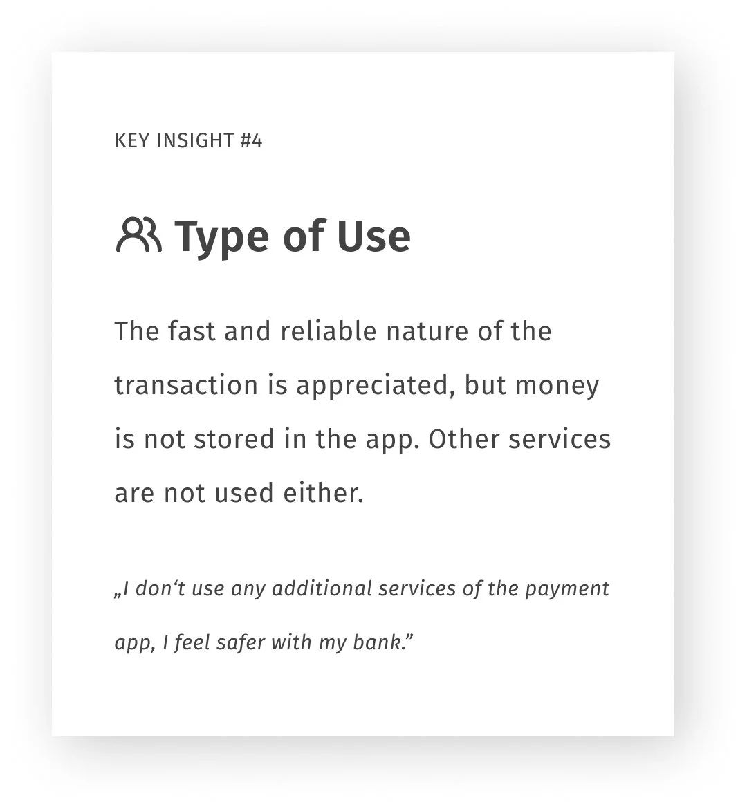
I think the most important realisation was that payment apps are really only used for quick transactions and are not really run like a bank account. So I was sure what direction I could go further in and what would become the main function so that it would add value to the user. I could then incorporate all the other findings into the design of the app.
DEFINE
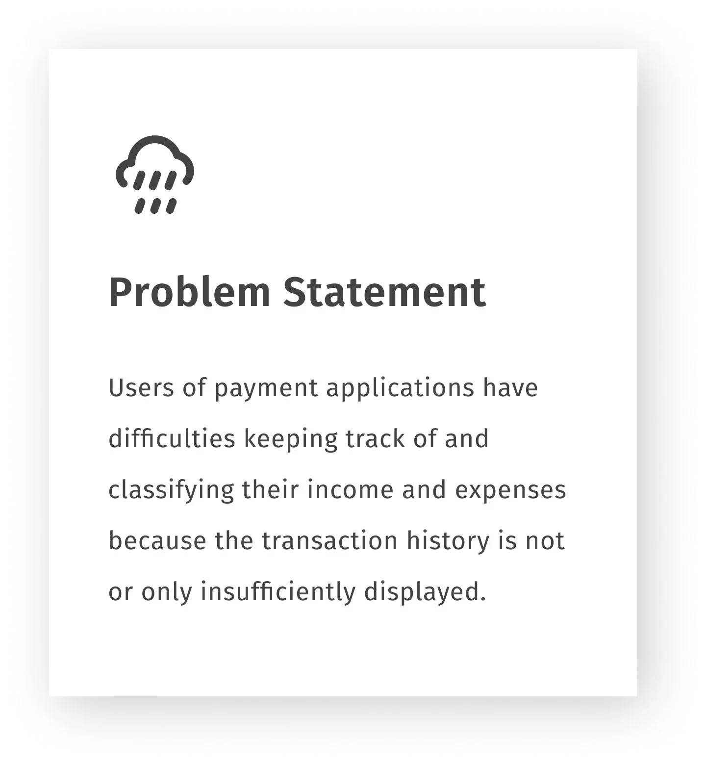
With the insights from the interviews, I was now able to define a precise Problem and Solution Statement. In addition, two main user groups emerged, for each of which I created a User Persona in order to better empathise with the target group.
After that, I wrote several User Stories that resulted in the creation of User Flows for three main features of the app. I then created User Journey Maps to evaluate further ways to improve the flows.
This phase was completed by combining all the elements and creating the Information Architecture.
USER PERSONAS
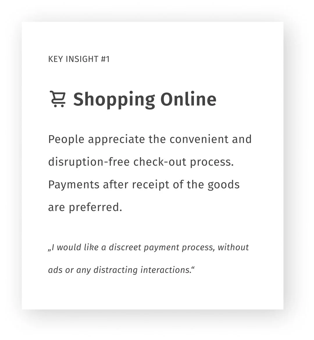
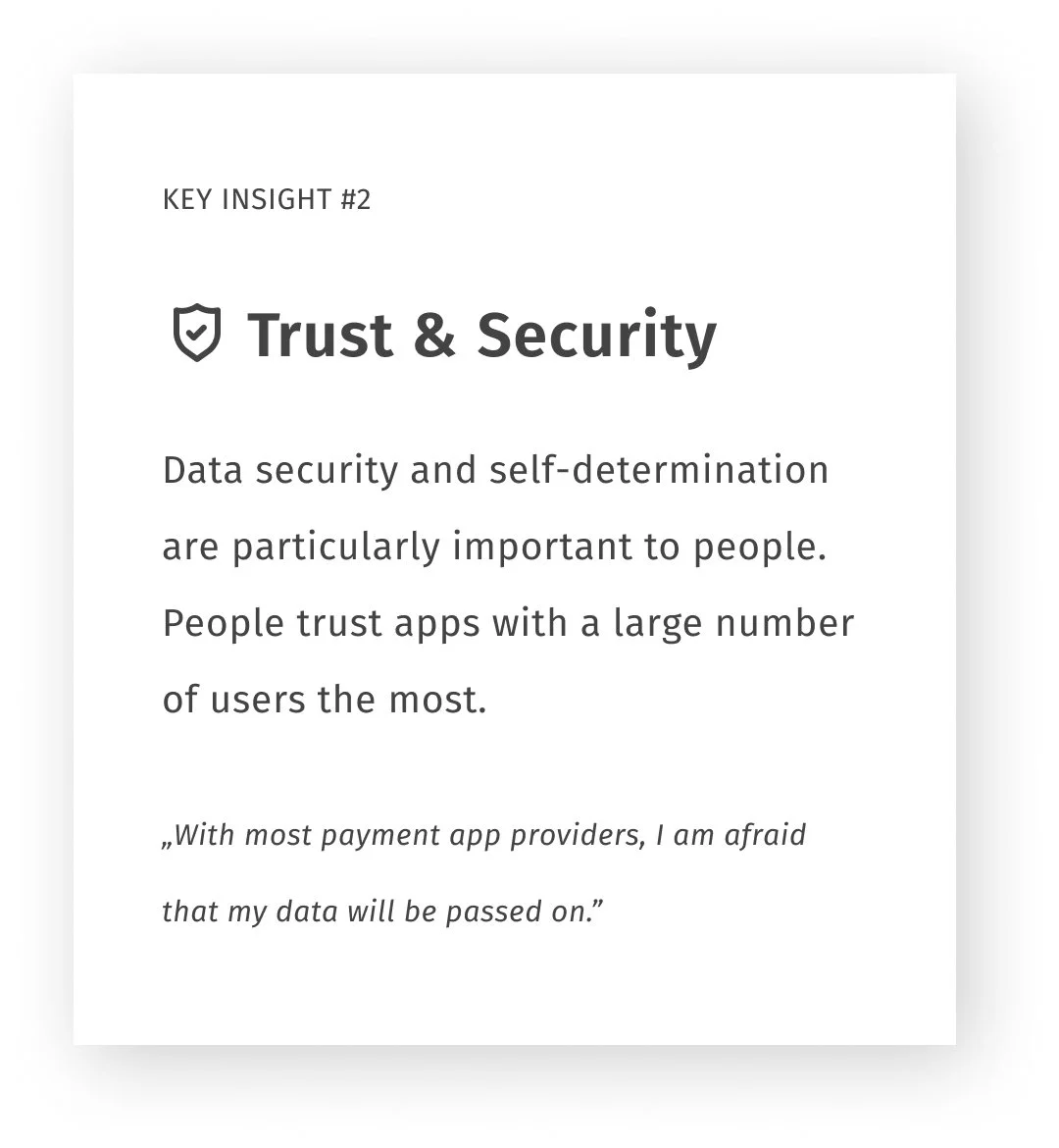
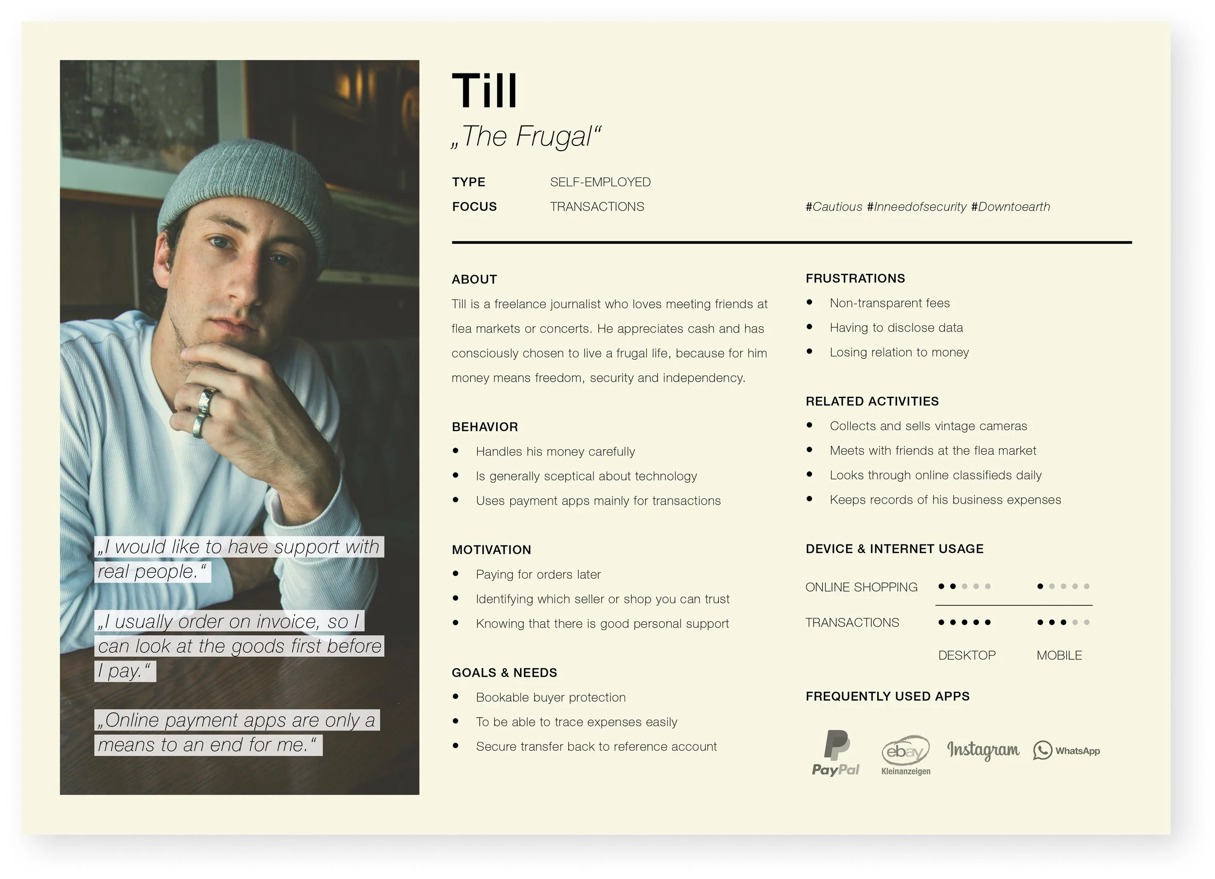
Two distinctive clusters can be formed from the previous research results. For each of these two clusters, I have created a characteristic User Persona. Persona Sami belongs to the regular, tech-savvy online shoppers and persona Till to the cautious users with a focus on transactions and data security.

USER FLOWS
Then I wrote clearly defined User Stories to create Task Flows and then whole User Flows, which finally served as the basis for the designs of the three features.
After that, I continued to think about the User Journeys to find further opportunities for improvement.
"As a first-time user, I need to be able to choose between different registration methods. I also want sufficient information about what happens with my data so that I feel safe and not exploited".
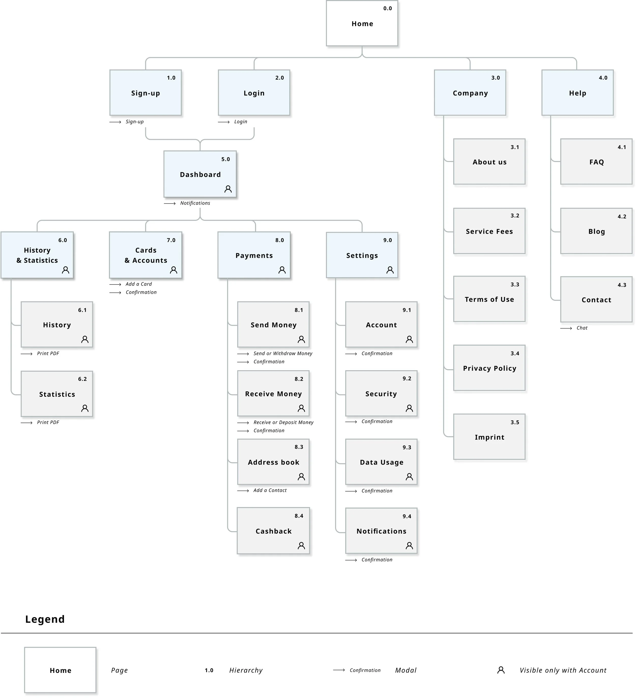
INFORMATION ARCHITECTURE
Once I had clarified the flows, I was able to start designing the architecture of the app so that seamless navigation was possible. For this, there were several iterations of the sitemap, where I further improved it with the help of Card Sorting, among other things.
IDEATE & PROTOTYPE
With the help of the Sitemap and the User Flows, I started to design the first wireframes with pen and paper. Step by step, the features and their fidelity level evolved with the aim of developing a clickable High-Fidelity Prototype for usability testing.

TESTING THE PROTOTYPE
The usability tests were very valuable at this point in order to identify and eliminate possible errors. After improving the issues and iterating the prototype, I tested the new variants using Preference Tests and developed them further.
USABILITY TESTS
The tests were conducted in a moderated manner, partly remotely and partly in-person. All tests were recorded for better evaluation. Feedback was analysed to identify similarities and recurring usability issues using Affinity Mapping and the Rainbow Spreadsheet method.
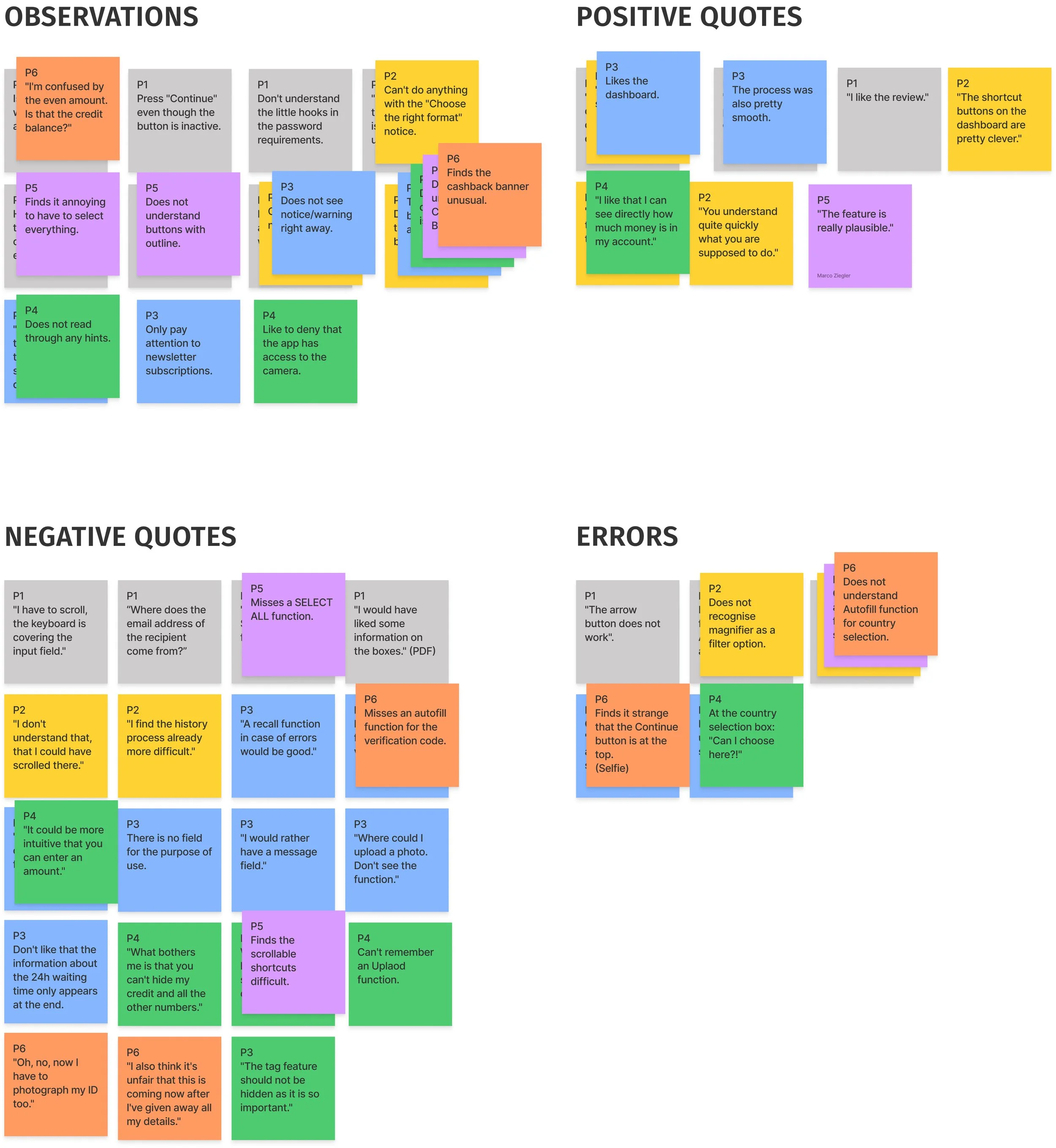
ERRORS & FINDINGS
The prototype and the designed features worked very well and were rated "easy to use" overall. Nevertheless, there were a few issues that needed urgent improvement.
See the complete Usability Test Report and revisions here:
Usability Test Report ➜

OTHER FINDINGS!
Besides actual usability problems, I was able to find out other problems of my users regarding payment apps. These problems or concerns coincided with the insights already found in my interviews. The concerns relate to the provision of personal information such as email address and other contact details, or confirming identity by taking a photo of ID. Unfortunately, there is no way around this provision as it is a legal requirement.
However, I found out that users would appreciate additional information in an appropriate place, so that they are informed early in the registration process. One user also mentioned, for example, that he would like to be able to download important documents.
REFINING THE DESIGN
Using the Gestalt Laws of Grouping as well as the Principles of Design, I iterated the design of the app. I also created a Soft 4 Point Grid for mobile as well as for the desktop version, which was used to align the elements.
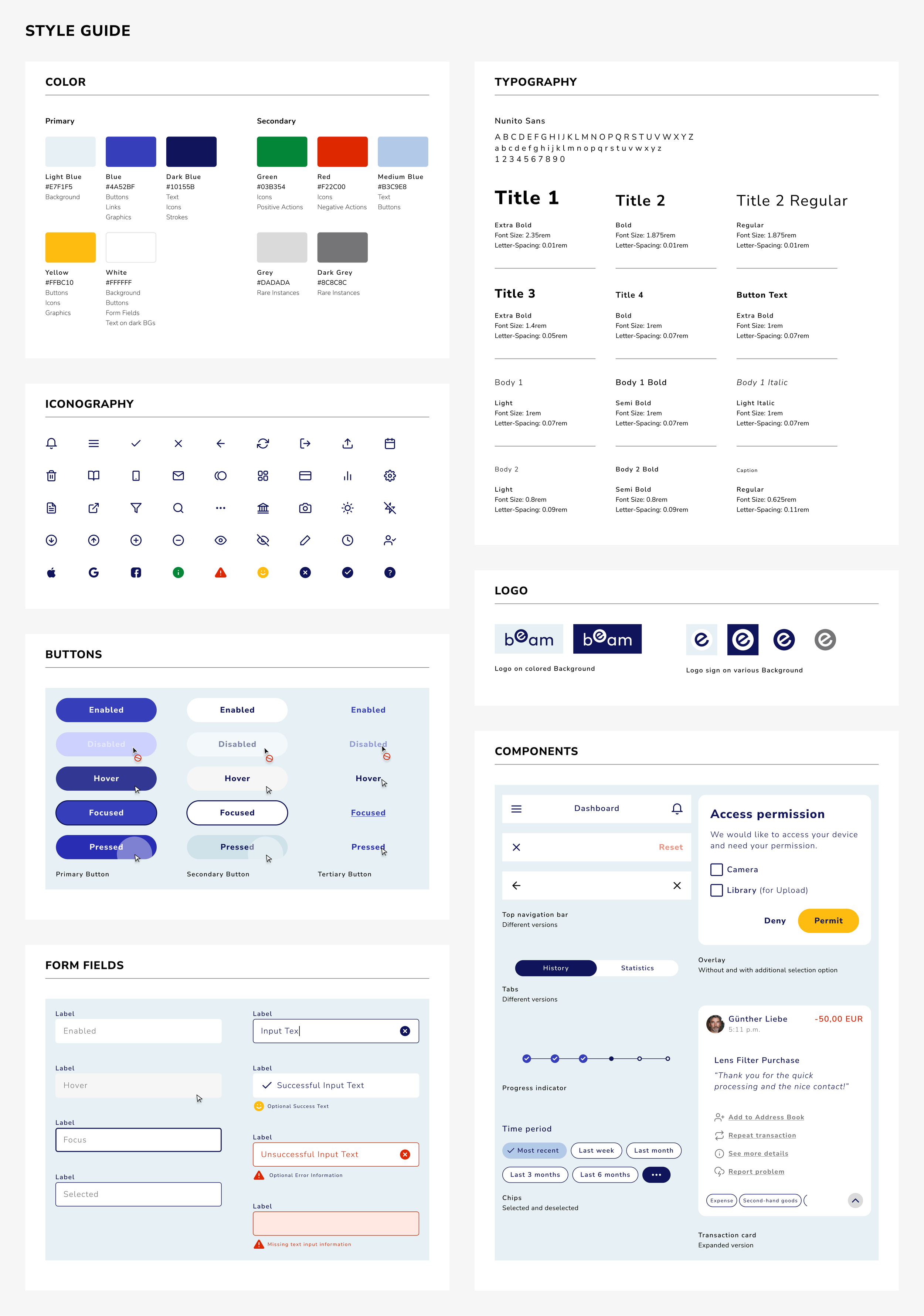
After that, I created a Design Language System based on a previously developed Style Guide. I also followed the WCAG guidelines to ensure optimal accessibility.
Finally, thanks to my design community on Slack, I was able to get feedback from four friendly peers to iterate the prototype one more time.
VISUAL DESIGN
I created an entire Design Language System where examples are shown of how to use the system and how not to use it. The documentation should help the developer to better understand and implement the concept and design.

KEY FEATURES
All screens were carefully revised and iterated several times until the final state was created. Below I'll show you a sneak peek of the three features I designed and explain what I accomplished. If you want to see all the final wireframes then follow the link to my Figma work file.
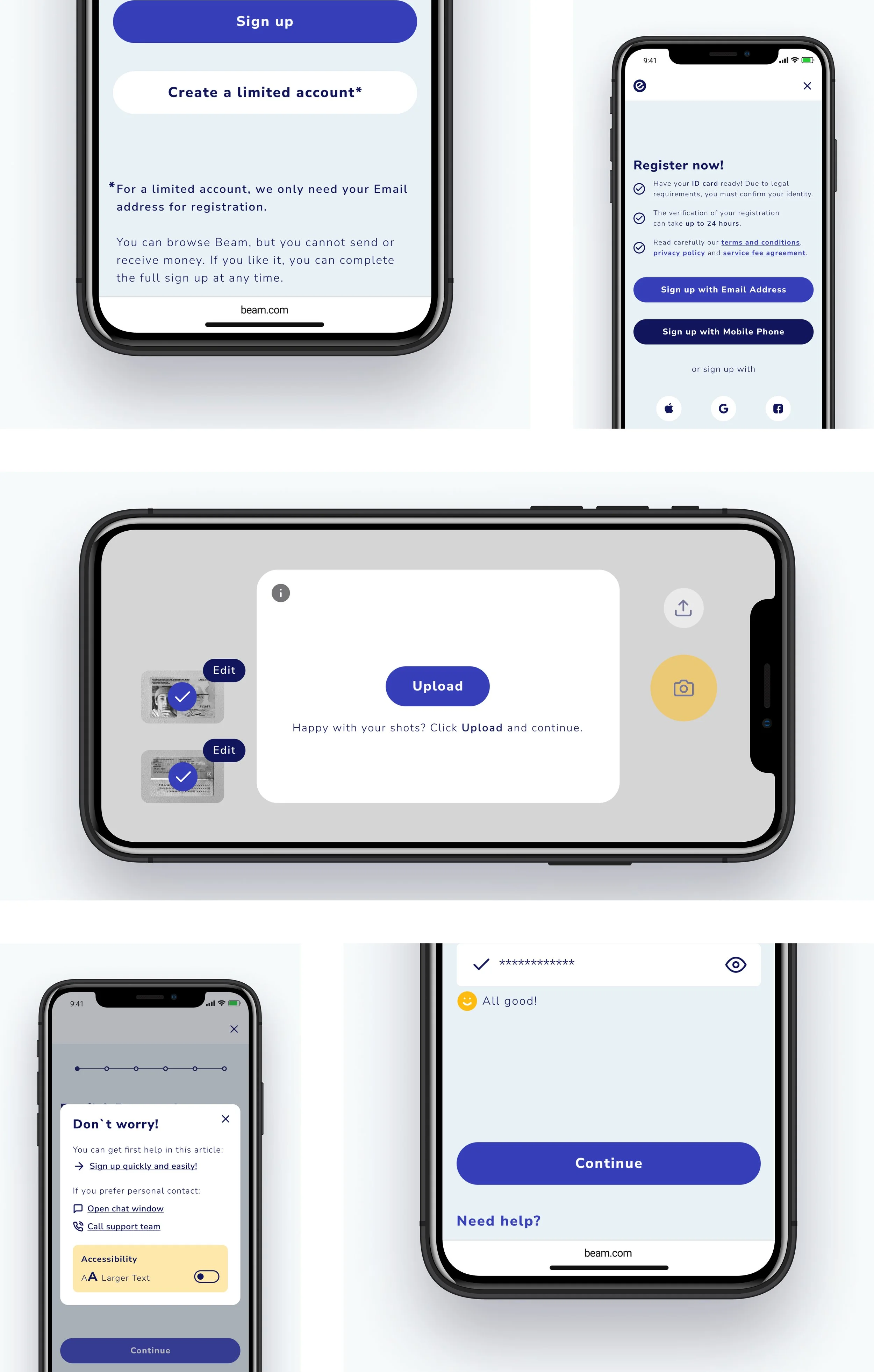
SIGN-UP
To appeal to as many users as possible, I have integrated different ways to sign up. There is also an option to register with limited access, so that particularly concerned users can take a look at the app first without having to disclose sensitive data directly.
The entire sign-up process has been designed to be as smooth as possible. Wherever feasible, I have tried to take into account the capabilities of the input device.
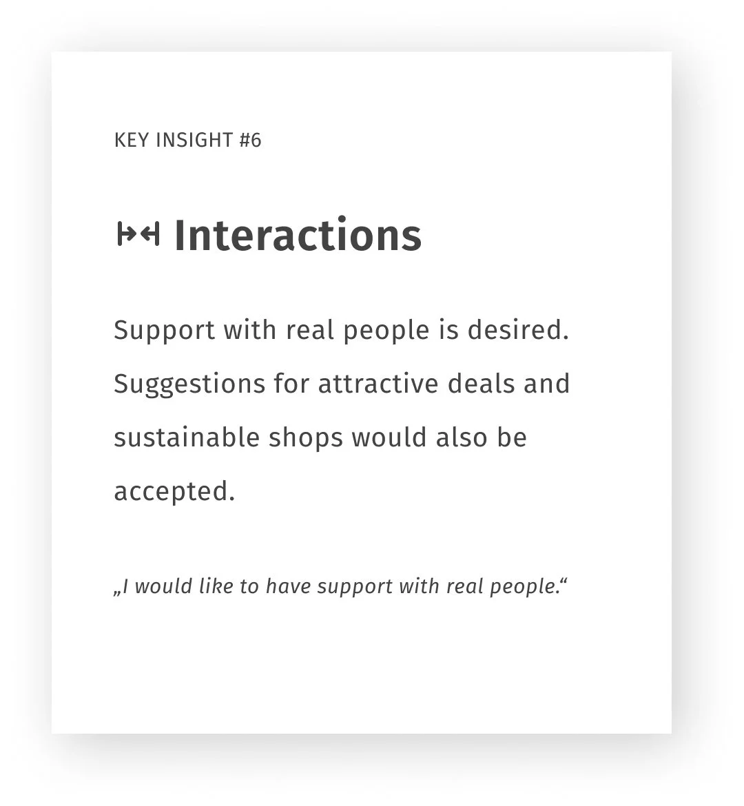
A help function can also be displayed at any time and personal support can be requested if necessary.
SEND MONEY
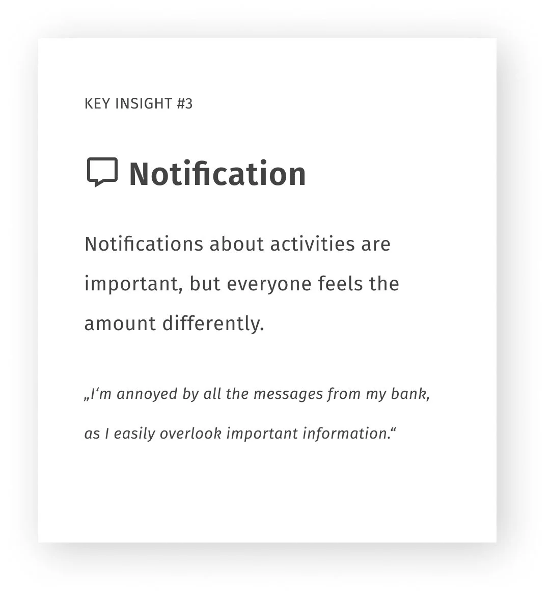
There should be no interruptions in transaction and payment processes, the flow may be relaxed and simplified with autofill functions. Here, too, it was important to me to inform the user at an early stage and to help him in case of problems.
All my testing has reinforced the existing studies that feedback along with a short transfer time gives the user a secure feeling that the transaction was successful.

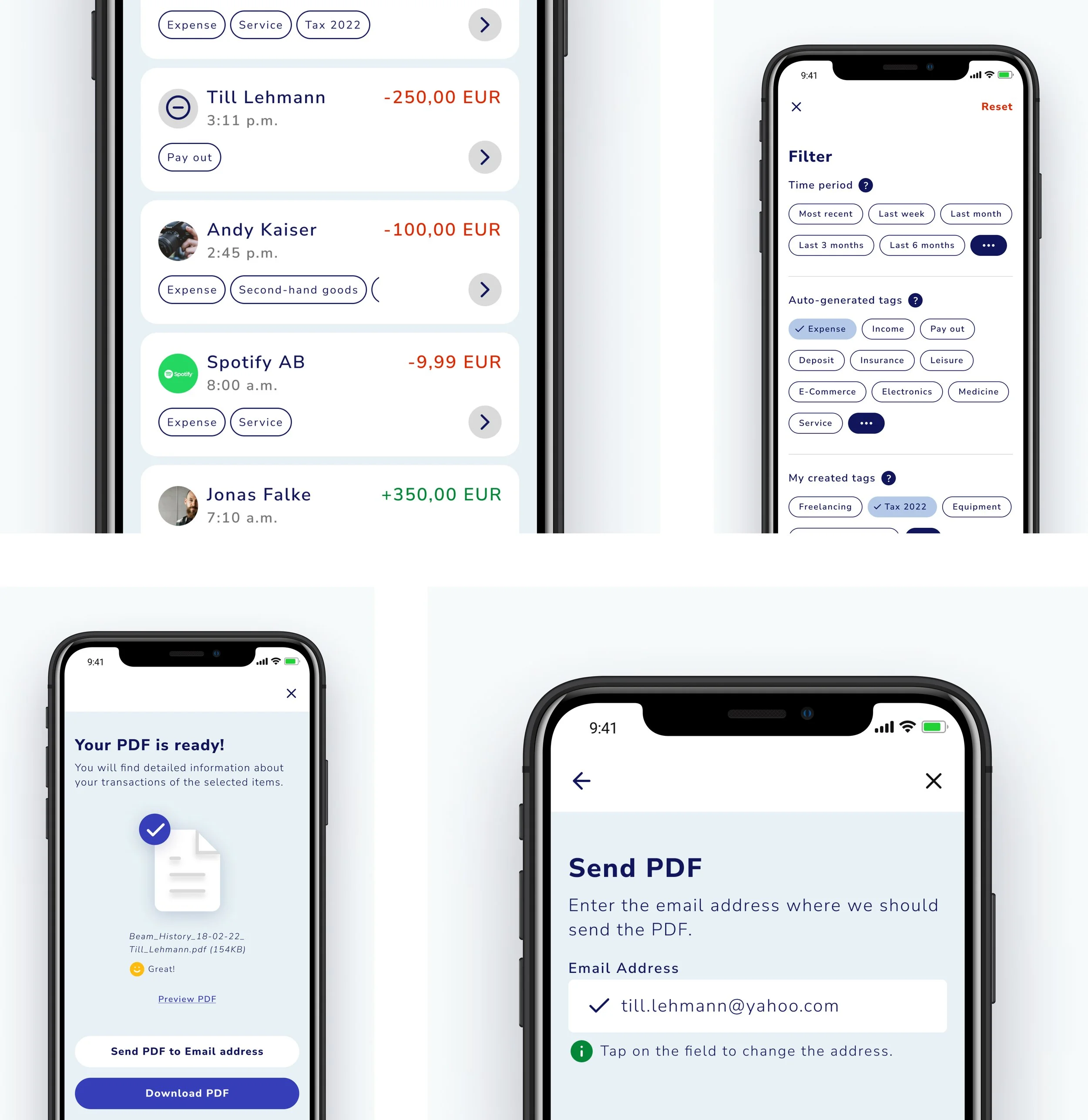
HISTORY & PRINT
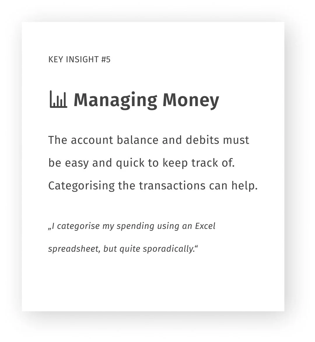
The special feature of the app is that transactions are automatically categorized using tags. With the help of a filter, the user can thus sort his transactions. Tags can be renamed, reassigned or newly created. The categorization is then also used for various statistics.
After sorting, the user can also create an account statement from his history and generate a PDF. It can be sent by email or simply downloaded.
FINAL PROTOTYPE
You can also use the arrow keys on your keyboard to click through the screens . To do this, place the cursor on the prototype and click once on the mobile screen. (Desktop view only!)
Have fun playing around!
CONCLUSION & LESSONS LEARNED
Several interviews, tests, feedback rounds and prototype iterations later, I learned a lot and I am very happy to have worked through the process so excessively. Nevertheless, I will take the following with me for all future projects:
#1 Test your ideas early and regularly with real users.
#2 Let go of ideas if they turn out to be unusable.
#3 Lean on your research results and stop doing guess work.
#4 Don't reinvent the wheel, just do it better.
#5 Don't be so detail-oriented, but focus on the big picture first.